What is Dynamic Data Visualization?
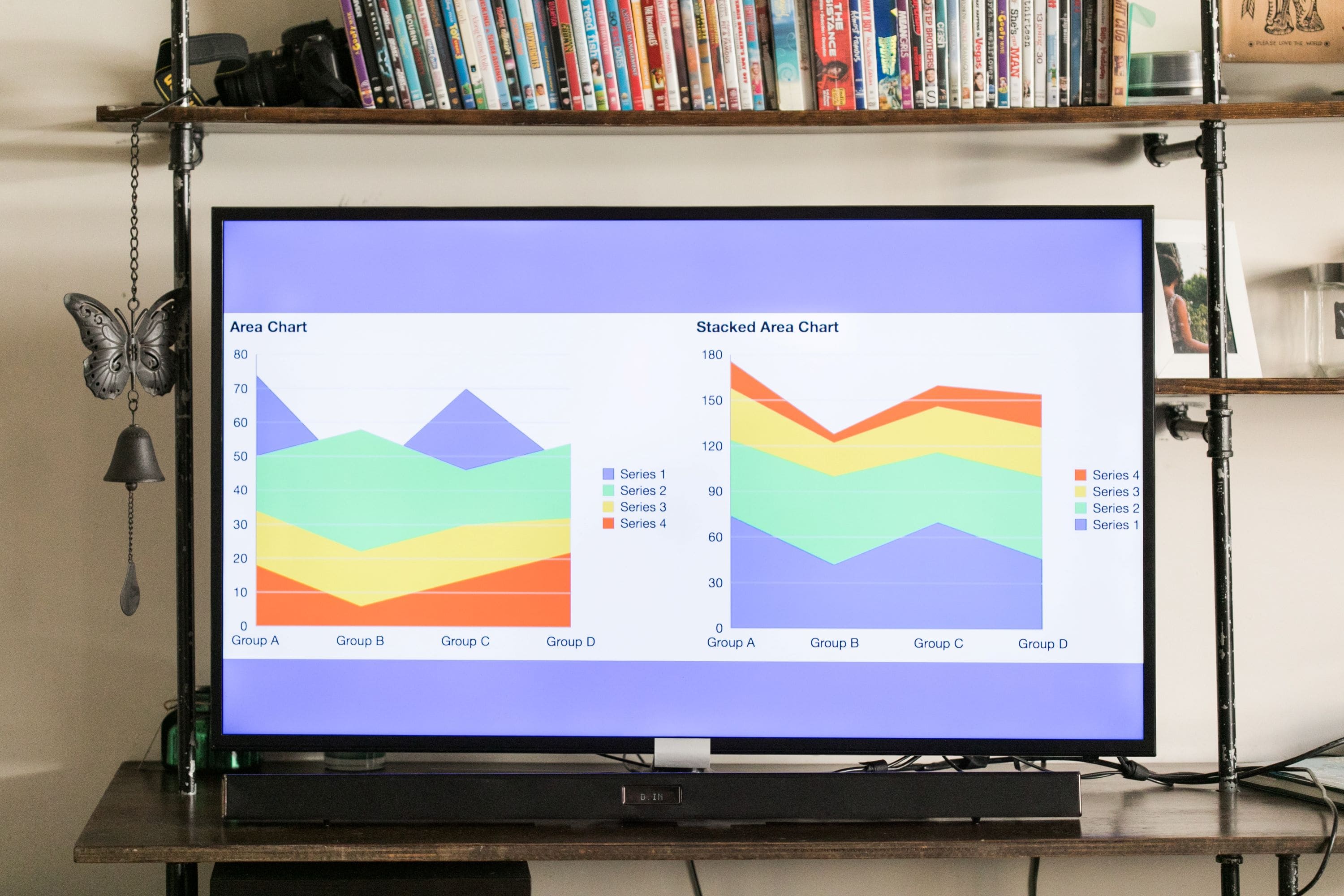
Dynamic visualization of data is more of an art than it is technology. It is the communication of information in an easy-to-understand yet insightful graphical manner. Dynamic charts and dashboards give us an intuitive and interactive experience with complex data that makes communication of key messages easier. Data visualization drives impact as it’s a part of many business intelligence tools to help business make sense of all the information or big data we are generating today.


How can it help?
The purpose of dynamic charts and dashboards is to select, filter, and read data more conveniently and quickly. Humanata uses top data visualization tools to provide you with several logical functions, such as:
- Parameter Filtering: View different data as per different conditions. This is the fundamental function of dynamic charts
- Parameter Linkage: Link two or more components to realize an automatic relationship between data. For example, click on the year sales, the order details of the year, the monthly return rate, and the sales ranking are going to be linked
- Drill Down: The common functions of dynamic charts are mainly to facilitate the expansion of multiple layer data to display you the most relevant information. For example, the drill-down map
- Parameter Panel Dynamic Display: In many cases, some query conditions will only be displayed when a particular condition is met. For instance, if you select a region on the map, the subsequent parameter box will automatically display the city and consumers in that region